Interview
Interview: Steven Conner
In conversation with London based Graphic Designer Steven Conner.
Can you talk about your journey into or interest in the arts?
My journey into the arts was relatively natural as I used to draw the whole time growing up. I entered art competitions at a very young age, and when at 15, I became obsessed with BMX biking, I created a character called Mega Mike which became a regular cartoon strip published in a national BMX magazine.
In the early nineties, I went off to Bournemouth & Poole College of Art and Design to study graphics during the heady days of rave. Next, I joined the Cavern Club in Exeter to be their in-house designer and events promoter. From working there, I knew I wanted to specialise in design for the music industry so, soon after, I moved to London and joined Sold Out to run the Metropolis Music and other promoters’ accounts.
After a decade working in this intense environment, I try to find some time to enjoy and focus on more creative, illustrative and experimental artwork.
Do you use a sketchbook? I’m interested in what a sketchbook means to you and your work, or how people develop their ideas.
I have always felt comfortable with a pencil in my hand, it feels natural and is the fastest way to work out a design for me. I have to plan a design first on paper, no matter how crude or rough the scribble is, as I need to have something to start from. I used to be impatient, and go straight to the computer to get cracking, but this did not really work for me as I would get lost and bogged down with technicalities of the software, more so than with an idea on paper. I have a lot of respect for those artists that use sketchbooks so wonderfully with care and detail, but I just use it for scribbling really. I still get more serious about my drafts when it comes to designing logos as they can be tricky to conceptualize. For example, I start by writing out the letters, over and over again, until hopefully I find that magic combination. Also, I sometimes draw in a more traditional way as my art teacher once told me to always keep sketching, even if it’s rubbish, so you don’t get rusty. I always think of that, and always will. I’ll admit that I should sketch far more often than I do at the moment though.
Your work is often very layered and illustrative in approach. Can you talk about your interests and how this feeds into your practice?
The work I think you’re referring to is the fashion montages. I have always been into fashion, particularly fashion magazines, especially during the 90s, also a time when fashion seemed to be a little more connected to graphic design. The Face and ID for example, two very iconic street culture magazines of that period, got me interested in design right from the very start.
Recently I have been lucky enough to work for the fashion& and music magazine Notion and got right back into it. This opportunity has fuelled my creativity for some personal projects and lately I have been producing more experimental work, by cutting out sections or glitching images. I love this interaction between fashion and design, and it’s rewarding and very fulfilling.
How do you balance commercial work and personal experimentation?
I do find it tricky to get that balance, as my full-time position in advertising is very busy, and can be draining. I often lack the drive and enthusiasm to do more design once I get home from work.
I always try my best to make time to work on my personal projects though, it’s very important to me. I find weekends best, in particular working late on a Saturday night with a few large glasses of red wine, listening to music. Maybe not too much wine though, or I will realize the next morning that what I designed the night before belongs in the bin!
How do you see the role of Graphic Design has changed over the past few years? Arguably it has gone through a change in terms of democratisation of technology, in essence meaning some of the tools of the trade are now easily accessible?
Technology has changed design a fair bit since I started. I’ve been designing print adverts for gig promoters Metropolis Music for years, the internet and social media have completely changed the game: they’ve opened new channels and more exciting ways to communicate. In the past, you would get a master advert approved and stick to that same design until the tour is over. Now, you can easily modify your advert, pink one day and green the next, upload it live, then take it down and replace it with no fuss. People want to see and expect things to be entertaining, they need variation to keep their attention, and that’s what is going to make them decide to ‘click’ for a ticket.
Digital graphic design is so alive and immediate these days, it keeps the designer on his or her toes, and pushes them to keep coming up with more inventive and impressive ways to work.
As far as the tools of the trade, I guess it’s a good thing that everyone can be a DIY designer: design your own website on Squarespace, design your own company logo, etc. Everyone has a right to be a designer and enjoy themselves doing it, and who is to judge if it’s good or bad? It’s your own taste, I’ve always believed that, been open-minded. I do think it’s great that, in 2020, software is easier to use, and so many helpful tutorials are available on YouTube. For example, a traditional artist can scan in cool parts of his or her oil painting, digitise and take it as far as they like with endless artistic dimensions and possibilities. I personally think embracing the full spectrum of what the Adobe Creative Cloud now provides is ideal to develop and communicate my art and it thankfully isn’t as intimidating as it used to be… Thanks to these technological advancements, it gets easier to pick up new skills and that’s exactly how I’ve recently come to learn to animate. I can now provide more up-to-date adverts for my full-time job, adverts that are no longer static and flat, but multi-dimensional and dynamic, with lights flashing on and off and music playing. Though After Effects is quite a stinker to grasp, my hours do fly by working on that darn timeline!
Can you talk about your process of working. How do you work, how often, is there a particular pattern?
Currently, I have more time available to work on my home projects every day, and I’ve become quite addicted to it.
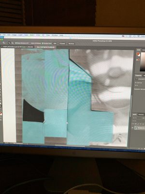
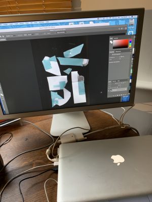
I work in a nice little studio area I set up at home with a table, computer, printer, scanner and piles of fashion and art magazines stacked up all around me for inspiration. How I generally work is by ripping up magazines and using the scanner, before finalising the project digitally in Photoshop or Illustrator.
My work pattern starts by a quick sketch of a composition I have in mind, then I will search for images to trigger off an idea for its content. I go through a process of printing textures from magazines pages, paper grains, ripped and sliced edges, dragged on the scanner and smudged with a wet finger. Using these methods provide me with the textural fine elements that I am looking to obtain. I do still like my overall pieces to look minimal and clutter-free, but to also offer lots of detail on closer inspection. That’s why my art should ideally be printed on a large scale so that the texture can be fully appreciated. A little Instagram post does not really capture all of this.
I often work in a fast and scattered way to encourage the unexpected, the imperfections and accidents. Basically, I will chuck bits and pieces on the bed of the scanner, without hardly looking at what or where I’m positioning the elements, until it’s revealing itself on screen. I like the anticipation and surprise in seeing what comes up. I will do this over and over again waiting for that one little gem!
Do you find the process of creating work relaxing or therapeutic? I’ve become increasingly interested in the relationship of the sketchbook and the work to the artist.
I find working from home both relaxing and therapeutic, probably the main reasons for doing it. With reference to the sketchbook, I do use one to pre-plan my projects, as it helps me to organise my thoughts, create a time to properly focus on my ideas and block out those day-to-day worries and anxiety, especially since my office hours are quite fast-paced.

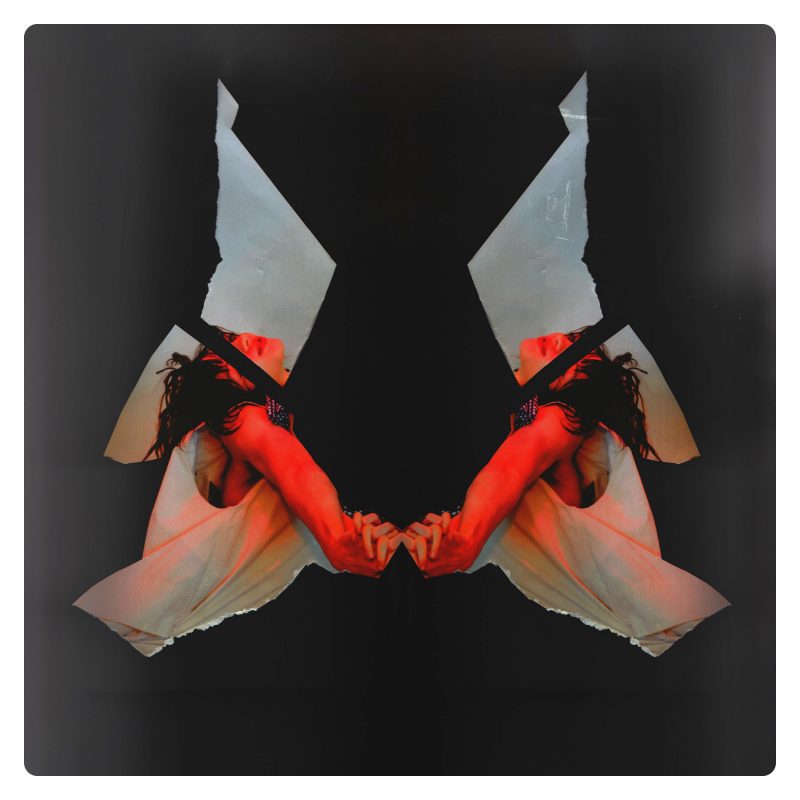
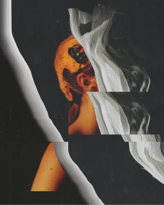
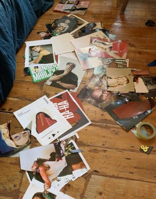
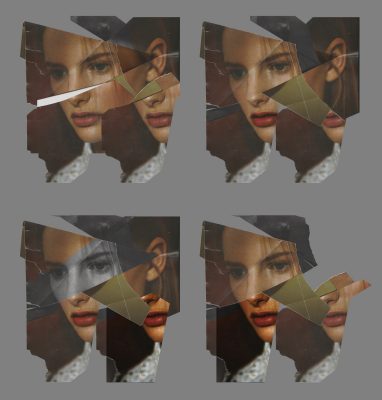
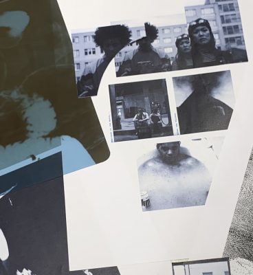
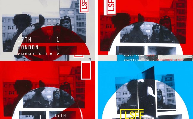
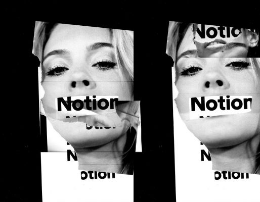

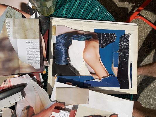
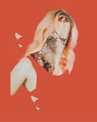
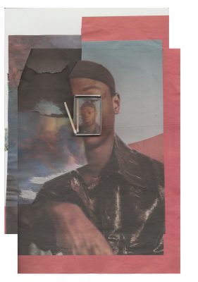
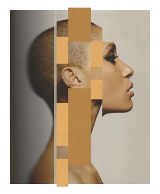
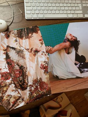
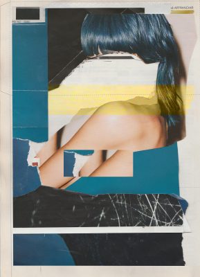
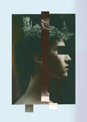

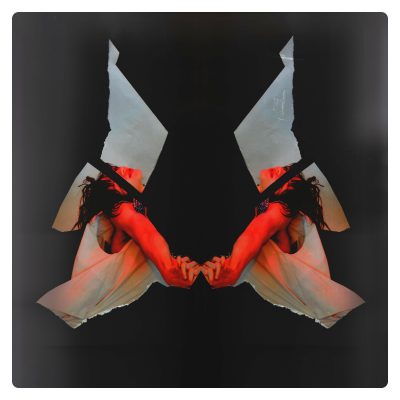
Yeah, I do like this Steve’s work. I think it poses a lot of questions around contemporary notions of race and gender…and frankly a lot of it just looks very edgy.
Thanks Edward. We’re glad to hear you like Steven’s work.
Fantastic read! A true genius when it comes to creativity
Thanks Alfie! I’m sure Steven will appreciate it.
Yesssss !!! I “met” Steve through his IG feed and immediately when I saw his works there I go to his web page and that was it ! I was thrilled and contact him immediately. Namely, my friends and me started a new independent magazine called 46pgs. which is heavy on graphic design and we try to present known and also unknown themes from the field of music, art, movies, books, everything… through one unique concept. Steven was “in” into minutes. I am glad that we have such a good “grunger” on our Board. Cheers.
Thanks Nevio, you certainly get to know an artist following their IG feed. Hopefully you’ll see more artists you’ll like here too.